
Risk-On / Risk-Off Indicator · 29 Equity Markets · Updated Daily
Risk-on means the market is paying investors to take risk. Risk-off means it has stopped. This page defines both states, lists the assets on each side, and shows how the regime is measured for 29 equity markets after every close.
WallStreetCourier Market Regime Research · 7 min read
Risk-on is a market state in which investors are rewarded for holding risk: equities, high-yield credit, cyclical sectors, emerging markets and commodity currencies advance while defensive assets lag.
Risk-off is the reverse. Capital leaves those assets for government bonds, the US dollar, the Japanese yen, the Swiss franc, gold and defensive equity sectors.
WallStreetCourier classifies each of 29 equity markets as risk-on or risk-off after every close, from 40 indicator types covering trend, market breadth and sentiment, with historical analysis since January 1985.
MSCI World, 1985 to 2026: the two states in numbers
Returns are annualised index returns on the days classified in that state, 7 January 1985 to 11 June 2026, before costs and taxes. They describe how the market behaved in each state, not the result of a trading strategy.
The definition alone does not tell you how much risk to take. What matters is knowing which state a market is in while it is still in it. An index can keep setting new highs even as its internal support weakens, and that is the divergence WallStreetCourier's framework is built to identify.
In risk-on, investors accept exposure because they expect to be paid for it. Equities rise, cyclical sectors outperform defensive ones, market breadth strengthens and volatility declines. Capital moves out of defensive positions and into assets that carry risk.
In risk-off, the same relationships run backwards, and they run faster. Positions built over months are unwound in days. Investors sell what carries risk and buy what preserves capital, across asset classes at once.
The terms became widely used after 2008, when correlations that had been low for years jumped during the crisis and seemingly unrelated markets began moving together under stress. What they leave open is the only question with money attached: which state is this market in today?
Recognising risk-off in hindsight does not protect your portfolio. Once a decline confirms the regime, the loss has already been taken. A useful reading must be available on the day itself, from evidence that changes before the price does.
The stakes are clearest in the drawdown column. In WallStreetCourier's MSCI World analysis from January 1985 to June 2026, the worst drawdown recorded within any risk-on state was 8.2%, compared with 59.1% for holding the index through every environment. The return an investor keeps is decided less by what is earned in the good states than by how much of it is surrendered in the bad ones.
Knowing the state does not mean predicting the market. The classification identifies the historical base rates for the current regime, and each state carries its own documented return, volatility and drawdown record. Sizing exposure to a measured condition is a different discipline from reacting to a decline that has already happened, and that difference is the entire case for measuring risk-on and risk-off rather than debating it.
The lists below show where money tends to move in each state. Safe havens such as government bonds, the US dollar, the yen, the Swiss franc and gold usually rise when markets fall. Defensive stocks and investment-grade credit are different: they tend to lose less than the market in a sell-off, but they can still lose.
| Risk-on assetsWhere money goes when the market pays for risk | Risk-off assetsWhere money goes when it stops |
|---|---|
| Equities, particularly growth stocks, technology and small caps | High-quality government bonds such as US Treasuries and German Bunds |
| Cyclical sectors such as industrials, consumer discretionary and financials | US dollar, Japanese yen and Swiss franc |
| High-yield bonds and emerging market debt | Gold |
| Emerging market equities | Defensive sectors such as consumer staples, utilities and healthcare |
| Industrial commodities such as copper and crude oil | Investment-grade credit over high yield |
| Commodity and high-beta currencies such as the Australian dollar (AUD), New Zealand dollar (NZD) and Canadian dollar (CAD) | Cash and short-dated government bills |
| Bitcoin and other volatile cryptoassets | Minimum-volatility and quality-factor equities |
These are tendencies, and individual episodes break them. None of these cross-asset relationships feed WallStreetCourier's classification, which measures the internal structure of each equity market. The next section explains why.
Investors read the risk regime from a small set of prices: the VIX, AUD/JPY, credit spreads, gold and the dollar. Each contains information and each is readily available. The difficulty is that none directly measures the internal support behind the equity index you hold, and their readings can disagree exactly when an answer would be worth money.
Common risk-on and risk-off gauges, and where each fails as a regime indicator.
| Gauge | What it shows | Where it fails |
|---|---|---|
| VIXVolatility index | Expected S&P 500 volatility over the next 30 days, implied by index option prices | Moves with the price, not ahead of it. A low reading does not tell you that the advance is likely to continue, and a high reading does not tell you when the selling is over. |
| AUD/JPYCurrency pair | A high-beta currency, the Australian dollar, against a funding currency, the Japanese yen. | Interest-rate differentials and central bank policy also move the pair. A change need not signal a change in equity risk appetite. |
| Credit spreadsBond market | The extra yield investors demand for corporate credit exposure over comparable government bonds. | Combine default expectations with liquidity and credit-market risk appetite. Tight spreads do not establish that equity internals are healthy. |
| Gold and the dollarSafe havens | Demand for safety and liquidity, alongside monetary and funding conditions. | Gold also prices real yields; the dollar prices monetary policy and funding shortages. The same move can therefore carry different meanings for equity risk. |
They share one weakness: each prices more than risk appetite. Gold prices real yields as well as fear; the yen prices monetary policy as well as deleveraging. The signal arrives mixed with something else, and the price alone does not tell you whether the equity market's internal support has weakened.
Internal support often deteriorates before prices do. The goal is to give investors the earliest reliable warning of rising risk, without forecasting prices.
WallStreetCourier asks the same 40 questions of 29 equity markets after every close, covering trend, trend quality (market breadth) and sentiment. It scores each answer positive, neutral or negative and lets the aggregate determine the regime.
Four steps from raw market data to one answer: is this market paying for risk?
The same process runs across all 29 equity markets after every close, in the same order.
Forty indicator types test trend, market breadth and sentiment. Is the trend intact? Are enough stocks participating, or is a shrinking group carrying the index? Does volume confirm the move? Are investors positioned complacently? Each answer is scored positive, neutral or negative.
What you get: evidence from inside the market you own, not a proxy read off the VIX or a currency pair.
The answers are combined into a Market Health Score from 0 to 100 for each horizon: short term, mid term and long term. One indicator turning is inconclusive. A score turning signals a broader change beneath the market.
What you get: one number per horizon instead of forty charts to reconcile before the open.
Together, the short-term and mid-term scores place the market in one of six regimes, from Very High Reward to Very High Risk. Regimes 1 to 3 are risk-on and 4 to 6 are risk-off, so the binary label follows directly from the six-state classification.
Long-term scores are used to identify structural bull- and bear markets.
What you get: which side the market is on and how far into it, to guide position sizing.
Historical analysis dating back to January 1985 gives each regime its own return, volatility, drawdown and retention statistics. The current state therefore comes with the distribution of what followed comparable readings, including how often the market remained in the same regime.
What you get: a base rate to size exposure against, in place of a forecast to believe.
Same rules. No narrative overrides. Every classification traces back to the indicators behind it.
No single indicator can change the regime on its own. Each reading is first combined with the other indicators in its group (trend, market breadth, sentiment), the three groups are then combined into the Market Health Scores, and only those scores set the regime. A lone signal that disagrees with the rest is outweighed. The same procedure runs for all 29 markets, each measured through its own stocks, so you can see whether an index is rising because most of its stocks are, or because a few heavyweights carry it.
Forty indicator types across trend, market breadth and sentiment, evaluated after every close for each of the 29 equity markets.
| Dimension | Indicators | Count |
|---|---|---|
| TrendShort-term | Trend Trader Index, Trend Trader Index Lines, Modified MACD, Advance-/Decline 20 Days Momentum, WSC Short-Term Trend Index, Price above 50 EMA, EMA 50 Line | 7 |
| TrendMid-term | WSC Trend Index, WSC Mid-Term Price Trend, Price above 100 EMA, EMA 100 Line | 4 |
| TrendLong-term | WSC Long-Term Trend Index, Price above 200 EMA, EMA 200 Line | 3 |
| Trend QualityShort-term | Percentage of Stocks Above 20-Day MA, Percentage of Stocks Above 50-Day MA, Upside-/Downside Volume Index Daily, New Highs vs. New Lows Daily, Modified McClellan Oscillator Daily, Modified McClellan Volume Oscillator Daily | 6 |
| Trend QualityMid-term | Percentage of Stocks Above 100-Day MA, Percentage of Stocks Above 150-Day MA, Advance-/Decline Index Weekly, Upside-/Downside Volume Index Weekly, Modified McClellan Oscillator Weekly | 5 |
| Trend QualityLong-term | Percentage of Stocks Above 200-Day MA, High-/Low Index Weekly, New Highs vs. New Lows Weekly, Modified McClellan Volume Oscillator Weekly | 4 |
| SentimentShort-term | CBOE Total Put-/Call Ratio Daily, Realized Volatility in % (10d), 9-to-1 Up-/Down Days, Percentage of Stocks with RSI(14) above 70, Percentage of Stocks with RSI(14) below 30 | 5 |
| SentimentMid-term | Z-Score Put-/Call Ratio, Realized Volatility in % (20d), Hindenburg Omen, Smart Money Flow Index, WSC Capitulation Index, AAII Bulls & Bears Survey | 6 |
| Total | 40 |
WallStreetCourier has been the official data provider of the Smart Money Flow Index for Bloomberg Professional since 2003. Developed by WallStreetCourier's founder, the indicator is one of the framework's sentiment inputs. Subscribers access the same indicator available on Bloomberg terminals. Full Bloomberg background →
Free account
Includes the complete Daily Morning Briefing, Market Research Reports and weekly Market Research Newsletter. One fully updated market each week.
See This Week's Free Market →No credit card required. Independent research since 1999.
Risk-on or risk-off is the starting point. Knowing that a market has stopped paying for risk is useful; knowing whether that happened last week or whether support has been eroding for two months determines how much exposure is still appropriate.
Each day, indicator readings are condensed into three Market Health Scores from 0 to 100: short term, mid term and long term. Short-Term and Mid-Term Market Health set the regime. Long-Term Market Health stays out of that decision and defines the structural context: 50 or above marks a Structural Bull Market, below 50 a Structural Bear Market.
In WallStreetCourier's historical MSCI World analysis dating back to January 1985, about 77% of trading days fall within Structural Bull Markets and 23% within Structural Bear Markets. A risk-off phase means something different in each.
The six market regimes, their risk side and the exposure stance each supports. Short-Term and Mid-Term Market Health set the regime; Long-Term Market Health defines the bull-/bear structural layer.
| Regime | Typical market conditions | Exposure stance |
|---|---|---|
| Risk-onThe market pays for taking risk | ||
1Very High Reward | Powerful uptrend, broad participation, lower volatility | Full exposure |
2High Reward | Strong uptrend that absorbs setbacks quickly | Full exposure |
3Increasing Reward | An uptrend establishing itself, internal support improving | Increase exposure |
| Risk-offThe market has stopped paying for risk | ||
4Increasing Risk | Uptrend weakening, market breadth narrowing behind the index | Take profits |
5High Risk | Established downtrend, elevated or rising volatility | Trim exposure |
6Very High Risk | Powerful downtrend, widespread weakness, very high volatility | Low exposure |
Exposure refers to the planned allocation to that market; the bar shows the stance from full (4 of 4) to low (0 of 4). Volatility descriptions are relative to the market's own history.
The boundary between Increasing Reward and Increasing Risk does not wait for the price. Increasing Risk still describes an uptrend. The index can keep setting highs while fewer stocks carry it, volume stops confirming the move and smart money steps back. The trend is intact; the support behind it is not. We draw the line there because that is where the market stops paying for risk, and the price high usually comes weeks later.
Direction
Risk-on or risk-off, for each of the 29 published markets.
Is this market paying me for risk right now?
Degree
Six states from Very High Reward to Very High Risk, each with its own return, volatility and drawdown record.
How much exposure does that justify?
Context
Structural Bull or Structural Bear Market, from Long-Term Market Health.
Is this a pause, or the next leg down?
The three reward regimes make up risk-on; the three risk regimes make up risk-off, so the two readings cannot disagree. Each regime is documented market by market in the market regime framework.
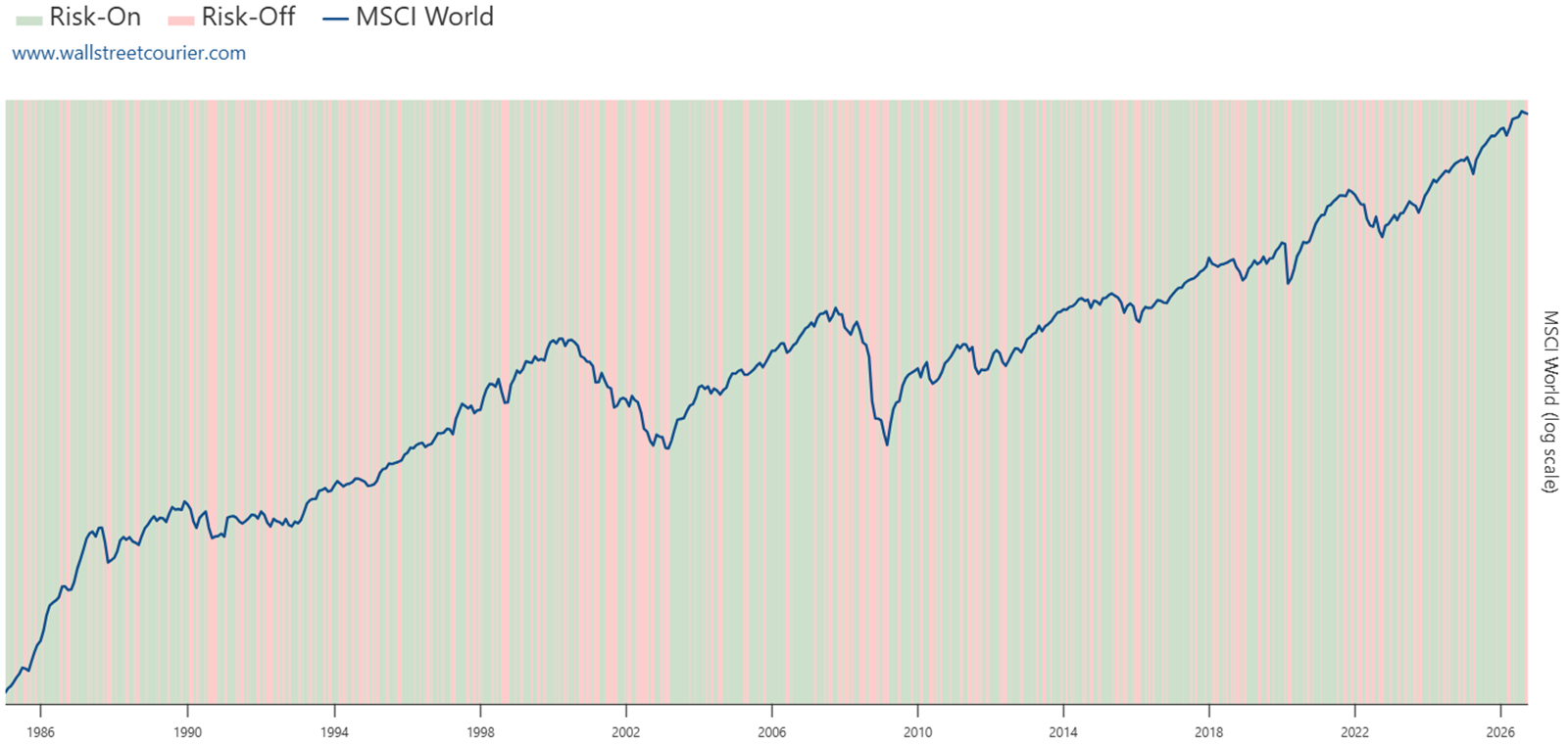
The MSCI World is WallStreetCourier's global reference for developed-market equities. When its risk-off reading is shared across regional and sector markets, the weakness is broad rather than local.
MSCI World by regime, 7 January 1985 to 11 June 2026. Risk-on accounts for 67.6% of trading days; risk-off for 32.4%. Index returns before transaction costs and taxes.
| Regime | Time share | Episodes | Return p.a. | Up days | Volatility | Worst drawdown | Sharpe |
|---|---|---|---|---|---|---|---|
| Risk-on67.6% of the time | |||||||
1Very High Reward (active) |
57.8% | 383 | +28.6% | 58.9% | 9.7% | −5.2% | 2.94 |
2High Reward |
6.3% | 195 | +38.5% | 56.6% | 14.8% | −5.4% | 2.61 |
3Increasing Reward |
3.6% | 88 | +46.3% | 57.3% | 18.3% | −8.2% | 2.54 |
| Risk-off32.4% of the time | |||||||
4Increasing Risk |
14.8% | 375 | −21.1% | 47.1% | 13.1% | −7.6% | −1.62 |
5High Risk |
9.2% | 262 | −9.7% | 50.0% | 17.0% | −9.7% | −0.57 |
6Very High Risk |
8.3% | 132 | −38.6% | 45.0% | 33.3% | −35.7% | −1.16 |
–Benchmark: buy & hold |
100.0% | n/a | +11.3% | 55.3% | 14.8% | −59.1% | 0.77 |
Time shares are rounded. Regime drawdowns cover periods within the named state; buy-and-hold drawdown spans the uninterrupted index history.
Three findings matter. All three risk-on states produced positive annualised returns over the sample; all three risk-off states produced negative ones. Very High Reward, the dominant state, recorded a Sharpe ratio of 2.94, against 0.77 for buy and hold.
The drawdown column shows the asymmetry that justifies the whole exercise: 8.2% at worst within a risk-on state, against 59.1% for holding the index through every environment. These are historical conditional statistics, not a tradable backtest and not a forecast.
Daily updates do not mean daily regime changes. Very High Reward alone accounts for 57.8% of trading days across 383 episodes. The classification stays in place while its defining conditions hold, so a daily price move does not automatically become a reason to trade.
In WallStreetCourier's MSCI World analysis from 7 January 1985 to 11 June 2026, 14 of the 20 largest daily gains occurred during risk-off, alongside 19 of the 20 largest declines. Only one of the 20 worst days occurred in risk-on.
This bears on the familiar objection that missing the ten best days ruins a decade's return. The largest gains are not distributed evenly across regimes. They cluster in risk-off alongside the largest losses. An investor who stays fully exposed to capture them accepts the other half of that distribution as well.
Most risk-off phases do no damage. In WallStreetCourier's MSCI World analysis from 7 January 1985 to 11 June 2026, more than half ended at or above their starting level. That is why the classification is not an automatic sell signal.
The value lies in the severe cases: every one of the nine deepest phases shown below reached Very High Risk.
Risk-off does not predict a decline. It identifies the market conditions in which the largest losses have historically developed. For an investor, that is the difference between reducing risk on a view and reducing it on a measurement.
The nine deepest risk-off phases, 1985 to 2026
The nine deepest merged risk-off phases in WallStreetCourier's MSCI World analysis, 7 January 1985 to 11 June 2026. Phase returns are measured close-to-close from the first day of each phase; drawdowns are measured within each phase.
| Phase | Trading days | Phase return | Drawdown | Deepest state |
|---|---|---|---|---|
| 4 Sep – 31 Oct 2008Financial crisis | 42 | −25.3% | −35.7% | Very High Risk |
| 24 Feb – 3 Apr 2020Covid crash | 30 | −23.8% | −31.3% | Very High Risk |
| 21 May – 8 Aug 2002Dot-com bear market | 58 | −19.7% | −23.4% | Very High Risk |
| 13 Feb – 4 Apr 2001Dot-com bear market | 37 | −15.2% | −16.0% | Very High Risk |
| 8 Aug – 2 Oct 20019/11 | 40 | −12.8% | −20.0% | Very High Risk |
| 23 Jul – 17 Oct 1990Gulf War | 63 | −12.8% | −19.6% | Very High Risk |
| 27 Jul – 25 Sep 1998LTCM / Russia | 45 | −11.3% | −15.1% | Very High Risk |
| 27 Apr – 2 Jun 2010Euro debt crisis | 27 | −10.3% | −13.2% | Very High Risk |
| 13 Sep – 17 Oct 2022Rate shock | 25 | −7.2% | −9.6% | Very High Risk |
Market regimes can differ across regions and sectors. WallStreetCourier's map plots all 29 published market views across six zones, from Very High Reward to Very High Risk.
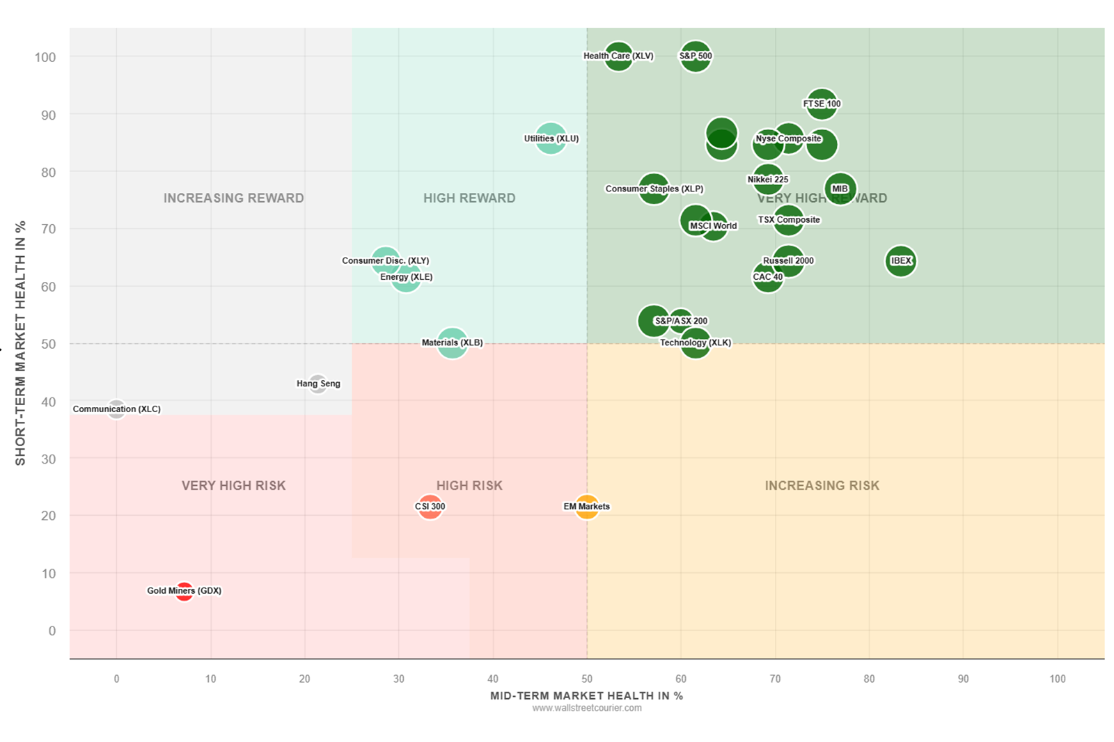
Two patterns are worth watching. Regional divergence flags exposure that needs reassessing when one region moves into risk-off while others hold up. Sector divergence shows when individual sectors weaken while the index itself remains risk-on; trend quality (market breadth) helps assess whether that weakness is isolated or widespread.
Coverage spans North America, Europe, Asia-Pacific and emerging markets, including US indices and sectors, the DAX, CAC 40, IBEX, FTSE 100, Stoxx 600, Nikkei 225, Hang Seng and CSI 300.
A classification is only useful if you can see what stands behind it on the day it changes. After every close, WallStreetCourier re-evaluates the indicators, recalculates the Market Health Scores and updates each market's regime. What reaches subscribers the next morning is the reasoning, not only the result.
Written research
Market Regime Research, every trading day. See what changed across trend, market breadth (Trend Quality) and sentiment, how it affected the Market Health Scores, and what would need to change for the regime to turn.
Market Dashboard
A dedicated dashboard for every market. See risk-on / risk-off KPIs, statistics for all six Market Regimes and performance in the current regime. Historical data going back to 1985 covers returns, volatility, drawdowns, retention probabilities and forward-return distributions.
Indicators
All 40 indicators, per market. Every reading is charted and scored, alongside the three Market Health Scores they feed. Nothing sits in a black box.
Big picture
All 29 markets in one view. The daily scatterplot shows where regimes differ across regions and sectors, making it easier to compare the risk profile of each exposure.
The classification informs allocation rather than entry and exit prices. Investors can use it to assess equity weights, consider rotation instead of a broad market exit, and interpret risk-off within a structural bull or bear market.
Follow a different market each week with free Basic access: risk-on / risk-off status, Market Regime, all 40 indicators, dashboard and written research. No credit card required.
Independent research since 1999 · official data provider of the Smart Money Flow Index for Bloomberg Professional since 2003
The six states behind the binary read, with the historical record of each.
One of the sentiment inputs, and a Bloomberg-listed indicator in its own right.
What the largest futures participants are positioned for, across 38 markets.
How the indicators are built, tested and aggregated, and which rules cannot be overridden.
You are currently viewing a placeholder content from X. To access the actual content, click the button below. Please note that doing so will share data with third-party providers.
More Information